Showing posts with label Drawing; Painting. Show all posts

Friday, March 23, 2012

"Pretty Ordinary" - A Series of Mixed Media work

These are the works I recently displayed at Provisorium in Munich. They also tie in with Creative Every Day's March theme of "Mixed Media".

I have called this series "Pretty Ordinary" and it is based around the idea I had of photographing ordinary things on the street - peeling paint, rust, cracks in the pavement, things that you wouldn't normally even notice -  seeing what the shapes and lines inspire in my imagination and then drawing and/or painting directly on the printed photographic images to bring those ideas to life. In other words, to make something pretty from something very ordinary.

It's a new way of working for me, quite experimental and fun. Sometimes an idea works well, other times less well (lots ended up in the bin!), but that's all part of the process.

What's interesting is how each of us might see something different in these patterns. What we see is shaped by our own experiences and interests. Anyone can try this technique. Just print your photo on matt photo paper, pull out any art materials you have to hand and let your imagination take over!

Here are the "before" and "after" images (sometimes an image is rotated before being illustrated on):

"Concrete Jungle" (Pencil, charcoal and paper blender on photographic image of rust drips on concrete wall)


"Home Sweet Home" (pen, watercolour pencil and gouache on photographic image of cracks in pavement) 


"Blown away at the Fair" (gouache on photographic image of rust on tip)
SOLD


"Just Bee" (pen and gouache on photographic image of a shattered glass wall)


"Fish School" (pen on photographic image of a shattered glass wall)


"Bluebell Woods" (gouache on photographic image of moss on a concrete wall)
SOLD


Each piece is a one-off original on photo rag archival paper, size 20x30cm. If you are interesting in purchasing one of the available works, just drop me a line at liaedwardsphotography@gmail.com for more details.

Tuesday, January 24, 2012

Illustration pour Vogue (Exercise 2, Illustration Course)

The second exercise of the OCA Illustration course involved choosing an editorial (magazine or newspaper article), reading it through a couple of times, picking out some key words, working out what the key message of the editorial is and then creating an illustration to communicate that message.

I thumbed through one of my old Vogues, and came across an article called "Liquid History" by Sophie Dahl. I love her writing (her cookbooks are brilliant), so although the subject matter (perfumes) was not really my thing, I was drawn to read it, and decided to use it for this exercise.

I can't replicate the entire article here, but in short, it went through Sophie's personal history of perfumes, how they relate to your identity, how you choose different perfumes at different times of your life either to reflect who you are, or who you'd like to be.  I took two key words away from the article: "Scent" and "Identity". In one section, she talks about "a glamourous friend whose French-Iranian mother wore stockings and suspenders, fur coats and the patchouli-laced L'Heure Bleue". The perfume was as much a part of this woman's outward identity as her glamourous fur coat. I loved this description so much, that it ended up being the inspiration for my final piece for this exercise (fig. 1).

Fig. 1


The Process

For my tutor and those interested to read more, here was the process I went through to get to this.

1. After reading through the article a couple of times, I did a spider diagram of key words (fig. 2):

Fig. 2

 2. I decided that the article really boiled down to two things: "Scent" and "Identity", and so I set about drawing a few thumbnail sketches with some different ideas (fig. 3):


Fig. 3

3. I decided to go with my third thumbnail, inspired by the French Iranian patchouli doused mother - woman as a perfume bottle (John Paul Gaultier-esque), with a fur coat draped around her shoulders, a 1950s Dior style hat dipped to disguise the face and other bottles in the background (the implication being that those other perfumes don't have the same personality).

4. I wanted the image to be very simple, quite graphic, a limited colour palette of black, red and grey (reminiscent of the Dior New Look era). Bearing in mind the audience (Vogue readers), I wanted it to have a fashion illustration feel about it, but more 1950s than anything too modern. I flipped through some books I have on fashion illustration for inspiration (fig. 4a) and then sketched out a rough composition. I then experimented with gouache paint using different brushes and brush strokes until I was getting the kind of strokes and textures I wanted for my final piece (fig. 4b).

Fig. 4a
Fig. 4b

5. Initially I painted over my sketched out composition, but this lacked the fluidity and spontaneity I wanted, so I started afresh on a blank sheet. I think this provides much more looseness to the brush strokes, because I wasn't trying to follow any sketched out lines. Finally I scanned it in and applied a warm filter over the image in Photoshop to give it more of a 1950s feel (fig. 5).

Fig. 5

What I learnt:

I really enjoyed the process of doing this exercise. It shows that illustration goes beyond just producing an image which is pleasing to the eye. It is about communicating an idea visually. In the case of illustrating the editorial I chose, it was about drawing the audience in, giving them an idea of what the article might be about, so they want to read more. I enjoyed the process of working out what idea should be communicated and thinking of different ways to show this. I also enjoyed using gouache paint. I like that the colours can be really strong in some places and more like watercolours in others. I'm sure I could have spent even longer refining this idea further, perhaps exploring some of the other ideas more fully. I also think perhaps a portrait format would have worked better for a magazine.

Sunday, January 15, 2012

Inspired by the Old and the New: History of Illustration (Exercise 1)

This exercise (the first in my Illustration course with the Open College of the Arts), involved researching a historical illustrator and a contemporary illustrator, comparing their styles and the media they worked in and then producing two illustrations, based on the same subject matter, in the style of each illustrator.

Here are my finished pieces for this exercise, on the theme of "The British Countryside", based on the style of Edward Bawden (fig 1.) and C.S. Neal (fig. 2):

fig. 1


fig. 2


And now for the longer part (for my OCA tutor and anyone else interested in the process behind these images).

Part 1: Historical Illustrator - Edward Bawden

For this exercise, I chose to research Edward Bawden (1903-1989) as my historical illustrator.  Bawden was fascinated with the printing process and much of his work was done via linocutting, lithography and copper engraving.  It is evident in the images from his prolific career (particularly his work for London Underground, see fig 3), that Bawden was very much an "observer" of life and had a great ability to find humour in day-to-day life.

fig 3.

Did his work seem "old-fashioned" to me? Well, in some ways, it looked almost contemporary, perhaps because of the clean graphic lines which the various printing processes he used (linocutting, lithography and copper engraving) lend themselves too. Perhaps also because there is a current post-modernist trend for all things "vintage". But then when you look closer at the images, the subject matter tells you they are off a time gone by (barber's shops, people wearing hats, more buses than cars on the streets of London). Also the detail in the technique immediately shows that this is not work that has been created digitally.

This high level of technique using printing media would be the first hurdle in creating a piece of work in Bawden's style. However, I started off by copying some of his simpler compositions (fig 4a, my drawing, and 4b, Bawden's original.)

fig. 4a

fig. 4b

Inspired by sketches and photographs I had taken on a walk along a canal in Buckinghamshire with my mother last November (fig 5 and 6), I decided the subject matter for my artwork for this exercise would be "The British Countryside".

fig. 5

fig. 6

This theme felt in keeping with the work Bawden did for London Underground, illustrating places that people could travel too by tube.  I chose linocutting as my medium, something pretty new to me, but a medium Bawden used frequently.

Overall I was reasonably happy with the result (fig. 7). The decorative border (of bird footprints), the composition, textures and everyday people are all inspired by Bawden's work. With hindsight, it could have had some of the underlying humour of Bawden's work (perhaps one of the swans going after the dog, although I wasn't sure if that would convey the right message about visiting the countryside). It is far from a perfect example of linocutting (I am still very new to the technique), but I like that you can tell this was made by hand.


fig. 7

Part 2: Contemporary Illustrator - C.S. Neal

I became aware of the work of Christopher Silas Neal (see redsilas.com) through the children's book "Under and Over the Snow" (fig. 8). It is illustrated beautifully and perfectly for the subject matter. I then discovered he has done much work for the New York Times, as well as other publications and book covers.


fig. 8

On his website, C.S. Neal tells you about his processes. He works using a combination of drawing, painting, braying, hand lettering and other manual techniques and then he composes and colours the elements digitally. This combination of digital and manual techniques elevates his work beyond the often too perfect, machine-made look of digital illustration and imbues it with the definite touch of a human hand. His style often plays with perspective: large subject matter in the foreground, with your eye then being drawn to something much smaller way off on the distance.

As I am only just starting to learn the Adobe Illustrator software, I didn't feel I yet had the skills to produce artwork in C.S. Neal's style digitally. However, it struck me that essentially he works in collage. So, I opted to use manual collage techniques with coloured paper, pencils, pastels and a variety of hand printing techniques (that I learnt on a recent printing course) to create my "contemporary" C.S. Neal inspired version of "The British Countryside" theme (fig. 9 and fig. 10).

fig. 9

fig. 10

From what seemed like an impossible task in the beginning, I'm pretty happy with the final artwork. I like the textures from the hand-printed elements of the collage, particulary the trees at the top (made by inking up some folded brown paper) and the house and I like the shape of the swan and the textured "plaque". I'm not sure about the reflection, whether that takes up too much room at the bottom of the composition, so perhaps that would go if I did this again. I think the image could look a bit more like the British Countryside too - it's a little too open and not green enough, but that probably comes from taking the "Over and Under the Snow" book as inspiration - it's set in North America.

What I have learnt from this exercise:

It has been really informative to look at other people's work, both historical and contemporary and to have a go with some of the media that these illustrators have used. Next time, I will try to consider more options and do more "thumbnail" sketches before deciding on a final idea. I need to think a bit more freely, consider more options and just play around with techniques a bit more. I have a tendency to be fairly single-minded in my thought process (probably from my days as a lawyer), planning and executing everything carefully, so now I am conscious of this, I will try to loosen up a bit!

Nevertheless, I have learnt both technical skills (linocutting, printing, drawing, painting textures, hand-lettering, collage) as well as compositional skills. I hope to improve on these throughout the duration of the course, but I am happy with the start I have made through this exercise. I will definitely continue to expand my knowledge of historical and contemporary illustrators and work on both manual printing and collage techniques and getting to grips with digital illustration.

Key Resources:
Edwards Bawden's London, Peyton Skipwith & Brian Webb
Design: Edward Bawden, Eric Ravilious, Peyton Skipwith & Brian Webb
www.redsilas.com

Sunday, December 18, 2011

Quick and Easy Stylish Christmas Tags

Loathe to pay 5 euros for a pack of 5 Christmas gifts, I decided to make my own.  I made 30 of these in about 20 minutes at a cost of less than 1 euro. All you need is some coloured paper or card, a pencil, a pair of scissors, a hole punch, some string and a pen.


Step 1: Measure your paper/card and mark into equal rectangles using a ruler (I got 10 rectangles from an A4 sheet of card).

Step 2: Cut along your marked lines so you end up with lots of rectangles.

Step 3: Trim the corners off one end of each rectangle.

Step 4: Hole punch one hole at the same end of the rectangle.

Step 5: Trim string or yarn into 15cm sections, fold each section in half, feed the ends through the hole in the tag and back into the loop of the rest of the string.

Step 6: Decorate as you desire. I just used a brush ink pen, but you could always use silver pen, Christmassy shapes cut out of contrasting coloured paper, a stamp and ink or cut out shapes using a scalpel.

It's snowing outside here in Munich and attaching these pretty tags to the presents I am wrapping is making me feel very Christmassy!


Friday, December 16, 2011

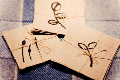
Sewn-up Christmas: Part 1 - Hand Painted Linen Coasters

I have been day-dreaming for some time about all these wonderful Christmas presents I was going to make now that I have my own sewing machine. So yesterday, with just over a week until Christmas, I decided the time had come to stop dreaming and get on with it.

First up, here are the coasters I made for some dear friends of mine. Each set of 4 has a different botanical themed design.


Here's how I made them (instructions are for one set of 4 coasters):

1. First, I cut out 8 squares of my chosen linen fabric. Each square was 13.5cm on each side. After cutting the first one, I used this as a template for the others by pinning it down on the fabric and cutting around it.
2. With each square, I pressed seams of around 7mm all around, then chopped the corners that stuck out, so they wouldn't be bulky once sewn together.
3. I then sandwiched two squares (pressed seams together), pinned in place and sewed around, finishing with a backstich.
4. Once all coasters had been sewn, I painted on my designs using black fabric paint. To fix the paint, I covered the coaster (design side up) with a piece of cloth and ironed over it for a few minutes. Voila!


They may not be perfect, the corners are a little iffy in places and the linen squares didn't always fit neatly on top of each other, but, being a novice at this sewing lark, I was pretty chuffed with them. And my friends who received them seemed to be too.

Variations: You could use the same technique with bigger rectangular pieces of fabric to make place-mats or double the coaster square size and add some wadding in between for a trivet. For the design, you could also have a go with stencilling or printing using potatoes or cut fruit.  Alternatively, just stitch across the coaster with different stitches in a contrasting thread.

Friday, December 9, 2011

My first ever digital illustration - "The Swan"

In order to get the most out of my Illustration course over the next year, I'm going to have to get to grips with digital illustration. So I opened up the (never used) Illustrator application that I had with my Photoshop software and watched some of the video tutorials. It all seems pretty complicated right now compared with just wielding a pen or brush - there is soooo much to learn! I'm sure I'll get the hang of it eventually (and it will help when I get a tablet and pen to draw with instead of the mouse!), but here's my first attempt (inspired by my Winter canal walk photos). Hopefully I can look back in a few months and see a vast improvement!


Sunday, November 27, 2011

Day 27 "Art Every Day Month" - Linocutting fun!

Since doing some research about 20th century British illustrator, Edward Bawden, for my illustration course, I've been dying to try out some linocutting.  In fact, linocutting and its predecessor, wood-cutting, are mediums that most of the great artists from Duerer to Picasso have used alongside painting and drawing. So I bought myself a little lino cutting set and thought it would be a great way to produce some handmade Christmas cards.

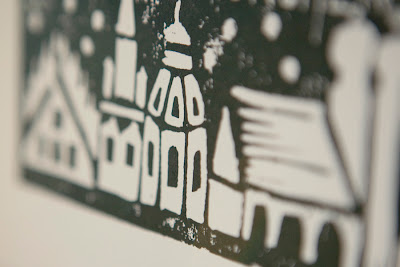
I can't show you the full final result yet, as I don't want to spoil it for the recipients, but here's a little sneak peek:


Here's the process.

1. Work out your design on paper, then draw this onto the lino. Make sure the design is in reverse (I check in the mirror)


2. Then, using special lino cutting tools, cut out all the bits that you want to stay white. You're basically carving out your picture to create a stamp. I recommend using a special linocutting worksurface, which has a corner to hold the lino in place and a lip to fit over the table. This will help avoid injury if/when the knife slips. Also always cut away from you, turning around the lino, if necessary.


3. After cleaning it up, roll the lino ink (I used black) onto the lino, press down a card or piece of heavyweight paper on top of the lino. Then hold in place while you use a spoon to rub the back of the card/paper.


4. Carefully lift off the card/paper and let dry.

5. Repeat steps 3 and 4 until you have all the prints you want (if you are doing lots like I did, you will need to regularly clean up the lino, so it doesn't get all clogged with ink).


I really enjoyed this process. I did nearly 40 prints and every one came out slightly differently. I hope the recipients will enjoy their little piece of unique Christmas artwork.

Friday, November 25, 2011

Day 25 "Art Every Day Month" - Winter Sketching

Art Every Day Month has really inspired me to get drawing. I'm less scared of it now and happier to just get out my sketchbook and have a go.  Here's a couple of sketches I did today:

The first is me in my winter get-up. It is completely imaginary, not from any reference (other than an impression of how I probably look going around town). I like the idea of doing a series of these with this character, on my bike, at the market etc. etc.


The second is a sketch I did of some of the elements of the Christmas markets in the Marienplatz in the centre of Munich. The elements don't all fit together, not all the details are there and I had to work quickly as my hands were frozen stiff from the cold, but I think I'll try to do little sketches like this every day to provide me with references to work from for more "final" pieces.


Wednesday, November 23, 2011

Day 23 "Art Every Day Month" - One Liners

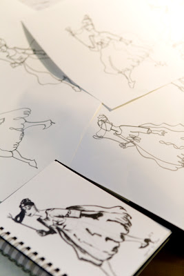
One-liners are a classic drawing exercise. The idea is to draw the whole image in one line, without lifting the pen from the paper until the drawing is done. It forces you to really think and see how all the elements of a particular form fit together in a two-dimensional space.  So I thought I would have a quick play with it this morning, using my poofy dress lady from yesterday as inspiration.

I drew her a number of times, each time starting at a different point in the image. Each one was completely different to the one before.


I probably could have gone on all day, but these were my favourite two.


You don't get a perfect picture, that's not the point, but I think it's pretty amazing the likeness you can get with one line.

Picasso was a master of the one-liners - here's a daschund one-liner by the man:


This is also a great one to try with kids.

Tuesday, November 22, 2011

Day 22 "Art Every Day Month" - Inspired by Fashion

Today, I headed to my local library for the first time since moving to Munich. I'm lucky in that my local library happens to be the main city library. And it really is a treasure chest. As soon as I located the art section, I knew I could get lost there for days. I didn't really go with any particular research in mind, I was just trying to escape the noise of the renovations in the apartment below me.

The first book that caught my eye was a huge tome about Manolo Blahnik. As I've previously dabbled in fashion illustration, but always struggled with feet (they are really hard - as are hands), I thought it might not be a bad thing to get some practice drawing shoes and feet.

I started off using pencil with this advert for Barney's New York, a photograph by Steven Meisel featuring Linda Evangelista draped over a sofa with a Manolo hanging from her finger (this was also good practice for face and hands). I forgot my eraser, hence the sketchy lines.


Then I moved onto shoes proper.


As I got more confident, I just got out my brush ink pen and made these exaggerated drawings, finishing them off with coloured pencil.


 While I was in a fashion-y mood, I had a go at copying this illustration by Tony Viramonks for Valentino (so Eighties!):


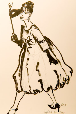
Finally, given my soft spot for the Dior New Look (see my 50s Revisited shoot from last year), I grabbed a Dior book I had seen on the returns trolley and created this illustration from one of the photographs (if you look closely, you can see the pencil prep work - it's a good idea to draw the body before you put clothes on it).


I just adored the big poofy dress!