Wednesday, February 29, 2012

Spider Diagrams: Exercise 4, OCA Illustration Course

This exercise involved making spider diagrams for a number of given words. The idea is to get you generating lots of ideas around one key word: to consider connections with a word or an idea, your own interpretation of what that idea means, colours, textures, places, feelings. Then to ask another person what words they come up with and see how many joint words you agree on and whether they come up with new ideas.  The idea behind this kind of brain-storming is that the more ideas you have for a particular commission, the more likely you are, through testing those ideas, to come up with the idea that best meets the needs of the commission.

Here are my spider diagrams for the words "Seaside" (fig. 1), "Childhood" (fig. 2), "Angry" (fig. 3) and "Festival" (fig. 4).  The words that came to my mind are in black, then I asked my husband to brain-storm the same words - his words are in red. Where we came up with the same words, I've underlined them in red.

Fig. 1

Fig. 2

Fig. 3

Fig. 4

What I learnt:

Some words I found easier than others to brainstorm, but once I got started and just wrote down whatever popped into my head, the words really started to flow. One word would lead to another and another, then something on a completely different tangent would pop into my head and that would then lead to other words.

The words would usually come first from my own experience of things associated with that word, especially with the "Childhood" brainstorm - we've all had a childhood and that's the only childhood we know of, so that's naturally the one we'll think about.

When I had exhausted words related to my own experience I would think about other interpretations. This was particularly the case with the word "Festival" which can have so many meanings. At first I thought about music festivals like Glastonbury, then I thought about traditional festivals, for example in Indian culture. Then it occurred to me that Christianity also has it's own "festivals".

I was surprised by the number of words I came up with and how quickly the page filled up with words.  The word I found hardest to brain-storm was "angry", perhaps because it is an emotion, rather than a visual place or memory or event, like the other words. I'm sure that would make "angry" much more difficult to draw too.

It was really interesting to see what words my husband came up with - on the whole, completely different to the words that popped into my head. It goes to show it's worth asking other people's opinions when generating ideas since we all have different experiences which can result in different ideas.

Writing a Brief: Exercise 3, OCA Illustration Course

This exercise involved writing a brief for an illustration. Illustrators usually work to a brief from the client so the idea behind this exercise is to provide a better understanding of what a brief may include and how this results in the final artwork.

For this exercise, I have chosen an illustration used on a full page advert in Vogue for Vivienne Westwood's perfume "Cheeky Alice" (fig. 1).

Fig. 1

In order to prepare my brief, I researched the Vivienne Westwood brand, as well as the concept behind this perfume and made notes around the brand identity and the characteristics of the perfume. I then considered the role of the illustration, who the audience would be and what "flavour" the illustration should have, as well as other details that the Vivienne Westwood creative team may have specified in preparing the brief for this illustration (fig 2).

Fig. 2

Here is the brief I prepared:

Vivienne Westwood will be launching a new perfume for spring, called "Cheeky Alice". As the name suggests, the perfume is feminine (with fresh and floral notes) but also sensual and a little bit provocative. This is a perfume that might be worn by a women aged 18-30, confident with her femininity, who wants to show that she is sexy, cheeky and a bit naughty. The Vivienne Westwood customer is one that is daring, pushes boundaries and is not afraid to be different from the rest of the crowd. The perfume will be promoted in fashion magazines, websites, beauty counters of the major department stores as well as traditional advertising billboards. For our advertising campaign, we need an illustration of a 50s style pin-up girl, vintage looking, but with something that indicates this is a modern-day girl (for example, she could be wearing Vivienne Westwood shoes). The pin-up girl will, of course, be sexy, but with an air of innocence - fresh and fun, like the perfume itself. A photographic image of the perfume bottle, with it's signature double red hearts and look of a bottle of magic potion will need to appear prominently in the image and there will need to be room for the Vivienne Westwood logo. The only text on the image will be the word "presents" under the Vivienne Westwood logo and a subtitle "a new fragrance for women". The brand colours for this perfume are a peachy red and gold and therefore the illustration must incorporate these colours. Above all, the image needs to capture the attention of the viewer, to draw them in and inform them immediately of the character of the perfume.

What I learnt:

This exercise was actually harder than I thought. Putting myself in the shoes of a creative director or art buyer of a fashion organisation really made me think about the multitude of things that need to be factored into to an illustration for an advertising campaign - the corporate identity, the branding of the goods to be advertised, colours, feel, layout, what text would need to be incorporated, who the audience would be. It also got me wondering about how much direction the illustrator would get for this type of commission. I imagine the illustrator's artistic freedom would be quite restricted and that the advertising team for Vivienne Westwood would have had a clear idea about exactly the image they wanted to see. I could imagine briefs for other commissions would be a lot less detailed and provide more scope for the illustrator to express his or her own creative style.

Wednesday, February 22, 2012

"Say Hello" (or "Stuff in my Head") - Assignment 1, OCA Illustration Course

The brief for the first assignment of my course in Illustration with the OCA was to prepare a greetings card to introduce myself to my tutor. The card should say something about me, my interests, my aspirations and the materials I am happy working with.

I decided to combine photography and drawing for this exercise, as that's really what I would like to explore most on this course.  Here's the final piece (fig.1).

Fig. 1


Process

This was the process for producing this piece.

1. Concept. I decided my concept would be a portrait of me and what is in my head. So I brainstormed "what is in my head" (fig. 2). This led to themes around creativity, drawing, photography, playing music, things that inspire me, like trees and plants, fashion photography, art galleries, my aspirations around combining my photography and illustrations in textile design. I liked the idea of a photographic portrait of me, with hand-drawn illustrations of all these things spilling out of my head/in my thoughts.

Fig. 2

2. Photography. I set up the camera and directed my husband to take some portraits of me on a bright day outside. The idea was to have me looking lost in my thoughts.  In Photoshop, I made my chosen image black and white (fig. 3), removed the background and extended the canvas in white to give me space to draw all the "stuff in my head" (fig. 4).
Fig. 4

Fig. 3

3. Illustration studies. I did some preliminary drawings as a study for what I might draw on the photographic image (fig.5). This is a collection of things on my desk and things from my imagination.

Fig. 5

4. Drawing by hand. I printed out the photographic image on matt photo rag paper (which as well as making beautiful photographic prints is also lovely to draw on) and using pen, I drew over the image to illustrate the "stuff in my head" (fig. 6).  This took about 2 and a half hours. You'll see there is music (the beginning of the Harry Potter theme tune and Beethoven's Moonlight Sonata), an Illustration textbook, paint brushes, pencil, tube of paint, an apple (I love my juices), my beloved camera, a copy of Vogue (I get a lot of inspiration from fashion), and various doodles and patterns that keep finding their way from my imagination onto any nearby paper.

Fig. 6

5. Digital colouring and finishing off. I scanned in the drawn image and decided it needed some colour (I had originally envisaged a black and white image). So I used various Photoshop brush tools (I was particularly fond of the airbrush tool) and various colours at an opacity of around 50% to colour in selected parts of the illustration but without losing the detail of the hand-drawn elements. In scanning the image in, I had lost some of the details in the hat, so I brought up the original photo file, moved it across as a top layer, then hid it using a mask and the paint bucket tool in black and then used white brush at around 50% opacity to "paint" back in the detail of the hat from the original image (fig. 7). Finally, I extended the canvas to the left to make a greetings card and printed out a copy to send to my tutor (fig. 8).

Fig. 7
Fig. 8

What I learnt


I really enjoyed combining photography, hand-drawing and then adding colour in using the brush tools in Photoshop. It feels like I am starting to find my style. The advantage with digitally colouring was that I could experiment and see what something looked like without committing to it (since you can always delete a Photoshop layer). I like the hand-drawn elements in the image. I don't think I would have got the same effect by drawing in Photoshop. My drawing skills are definitely improving and I am learning new ways to use Photoshop.

It was also a good process to have a think about my identity, what it is that makes me. What things occupy my thoughts? What inspires me and what do I aspire to do? In this illustration, I've tried to focus on where I am now. Not where I've been, what my past experiences are. Those things, of course, influence who we are right now, but rather than looking back, I wanted this to be a snapshot of the present moment and the ideas and aspirations I have for the future.


Wednesday, February 15, 2012

Digital Illustration - Alliums with Blue Petal Sky

In my effort to start getting to grips with creating illustrations using Photoshop, I tasked myself today with getting to know the Photoshop brush tools. I just spent a couple of hours playing around with different brushes in different sizes, colours and strengths.

To start with, my marks resembled those of a 2 year old learning to hold a pencil. But slowly, I began to get an idea of the different textures Photoshop had to offer and felt more comfortable with the digital pen. I made some pretty background textures for use in future projects.  These were some of my favourite:


It's actually a good warm-up drawing exercise to draw very simple shapes and patterns, since the left side of your brain gets bored, leaving you open to the creativity that comes from activating the right brain (for more on this, see this post)

Point in case, before I knew it, I was drawing a circle pattern with one of the funky fluffy brushes and suddenly it transformed into this little illustration of Alliums with Blue Petal Sky.


It must be my subconscious looking forward to spring, amidst all the snow we have here at the moment!


Sunday, February 12, 2012

Photos from the exhibition!

Click on the link to see some more pictures from yesterday's exhibition (and to check out my new website). It was so much fun!

http://www.liaedwards.com/


Thursday, February 2, 2012

I'm exhibiting!

On Feb 11th, the Munich Creative Arts Group will be having a "pop-up gallery" of artwork from a number of artists, along with musical performances and readings of original works.

I'll be showing a selection of black and white landscape photography of the stunning scenery of South West America. Here's a sneak peek:


Here are the details. Hope to see you there!


Wednesday, February 1, 2012

Can anyone learn to draw?

There is no such thing as "talent" when it comes to drawing. That was the big revelation at the course I did a couple of weekend's ago based around the Dr. Betty Edwards school of learning to draw. Betty (no relation) advocates that anyone can learn to draw. It's not about your hands. It's about your eyes, how you see. And, Betty claims, anyone can train their eyes to be "artist's eyes". I liked the sound of that, so was interested to find out what I would produce by the end of the weekend using Betty Edwards' classic exercises.

The basic theory goes something like this: there are two sides to your brain. A right side and a left side. The left side is responsible for logic, knowledge, facts, language. The right side deals with intuition, feelings, emotion, instinct and importantly how we view things. In most people, the left side dominates. This can be a problem when it comes to drawing, because, the left brain will always tell us how something "should" look, according to the knowledge we have amassed. However, if we allow our right brain to take over, and trust in what we see in front of us, then our visual mode can kick in and we can draw exactly what we see, not what we think we should be seeing.

Here are some of the exercises we did to get that right side of the brain (and therefore the visual mode) working:

1. Upside-down drawing

For this exercise, we replicated a line drawing, only the drawing was upside-down. What this meant it that (for the whole part), your left brain finds it more difficult to put labels (like "head, eyes, hands etc.) on the parts of the image you are copying , so it drops out, allowing your right, visual, side of the brain to focus on drawing lines. Just lines. Not hands, or legs or anything. Just lines.


I was really amazed that I managed to (fairly accurately) reproduce the lines of this portrait of Stravinsky by Picasso. I never would have been able to draw those fingers and thumbs like that if I had thought of them as fingers and thumbs rather than as just lines.

2. Blind Contour drawing

With this exercise, you don't look at the paper at all. You just draw while the whole time looking at your subject matter. Again, this engages the visual mode of the right brain.

Your drawing will look complete rubbish, since you don't know exactly where you are on the page at any one time, but that's not the point of this exercise. The point is to use it as a "warm-up", to get you familiar with the subject. So that you get to know exactly what it really looks like (not what the left brain tells you it should look like).

3. Getting perspective - using a glass frame

Conveying a sense of depth is perhaps one of the trickiest things of all about drawing. How do you render something three dimensional on a two dimensional piece of paper?

Betty Edwards devised a method of using a glass or plastic "frame", through which you see your object and, closing one eye and keeping your head in the same place (so that the view doesn't alter), drawing the outline of the object directly onto the glass frame. Like this example with the outline of my left hand:


But she didn't invent this. Even the old masters such as Duerer used similar methods to understand perspective:


Once you've got the outline, it's easier to transpose this to paper, and then, using your actual object again as reference) fill in the remainder of the details.

Here's a banana I drew using the glass frame method, and then finishing off with details and shading by just looking at the banana (ie not through the glass frame):


4. Drawing the negative space

In this exercise, instead of looking at your subject and drawing its outline, you look at the negative space - the gaps between parts of the subject and draw those "holes" instead.  To start with we did this with a fashion photograph from a magazine.


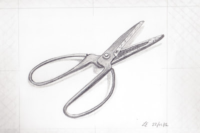
Then we combined this method with the method used in 3., above, to draw a real object in front of us, in this case, a pair of Chinese style scissors. To do this, we chose one "negative space" element to draw through the glass frame, then drew the same shape on paper and then continued working on paper, only using the frame as and when necessary to get an idea of the other shapes. Here's my final drawing of the scissors, using this technique.


5. Rendering light and shadow

Finally we considered different methods of creating light and shadow, stippling, applying different pressure to the pencil, using pencils of different softness, hatching and cross hatching. The picture below shows how you can give the impression of a three dimensional object using different degrees of cross-hatching.

I was really amazed with the drawings I produced using the methods advocated by Dr. Betty Edwards, and the techniques have certainly made me more aware of how my brain works and how this affects the process of drawing. Above all, I've learnt to trust in what I see (not what I think should be there), to give myself time (the left brain will always be impatient) and to PRACTICE, PRACTICE, PRACTICE!


Resources:
Drawing on the Right Side of the Brain, Betty Edwards
Munich Volkhochschule (Kurs "Zeichnen, aber anders")