Showing posts with label Creative Thoughts. Show all posts

Monday, April 16, 2012

After a break...

I've had a bit of a break from drawing and illustration lately. I won't bore you with the details why, but I needed something to help me back into the swing of things. So I went back to where I originally rekindled my passion for drawing: fashion illustration.

I did two illustrations, based on some magazine images, first using pencil and then finishing with waterproof fineliner pens and some inks. Face proportions are really tricky (especially a 3/4 profile face). I don't think I've quite nailed it here, but at least it's got me started again!


Monday, March 5, 2012

Words to Pictures: Exercises 5 & 6 OCA Illustration Course


In this post, I've combined Exercises 5 and 6 of the course. Exercise 5 is about turning words into pictures and involved taking one of the specified words (I chose "Exotic" from the list) and sketching as much as possible around this theme. Exercise 6, then involved taking the same word and creating an inspiration board around that word from pictures in magazines, fabrics, textures. I thought it would make sense to effectively do both of these exercises together.

First, I did a spider diagram around the word "Exotic" (fig. 1).

Fig. 1


The spider diagram threw up a lot of possibilities, but I decided to focus on exotic flowers and plants. I had a go at sketching things around this theme with no reference, just from my imagination and memory (fig. 2 and fig. 3).  The aim here wasn't to produce some beautiful drawings, but rather to translate into picture form some of the words from the spider diagram.  I'm not a big fan of pastels, but there were quick to work with and meant I could colour large areas quickly, even if the result wasn't really my style. 

Fig. 2

Fig. 3

To get a look at the real thing, I decided to make a visit to the Munich Botanical Gardens, where I made some sketches (fig. 4 and 5) and photographs (fig. 6 and 7):

Fig. 4


Fig. 5

Fig. 6

Fig. 7

Finally I went through fashion and interiors magazines, the Bridgeman on-line library and some of my own reference books, and used those materials as well as some of my own photographs from the botanical gardens to put together this colourful inspiration board (fig. 8). 

Fig. 8

What I learnt:

I was really interested to see with these exercises how I would get from words to pictures. As an ex-lawyer, I tend to find words easier than pictures. I found it particularly difficult to try and sketch ideas from memory, but was surprised once I got thinking, how I could visualise some exotic flowers and leaves from memory, even if I wasn't that impressed with my sketches of them. It was also good to go to the botanical gardens to draw the real thing and get some more drawing practice (although this did take way longer than the initial "memory" sketches. Drawing from memory is something I need to practice more, but that's something that should improve as my general drawing skills progress.

My favourite part of this exercise was pulling together all these different reference materials into my inspiration board. I can definitely see how having this up in front of me as I work, would inspire me to get painting and drawing around the theme "exotic". Who knows, this may even inspire a fabric design along this theme...

Wednesday, February 29, 2012

Spider Diagrams: Exercise 4, OCA Illustration Course

This exercise involved making spider diagrams for a number of given words. The idea is to get you generating lots of ideas around one key word: to consider connections with a word or an idea, your own interpretation of what that idea means, colours, textures, places, feelings. Then to ask another person what words they come up with and see how many joint words you agree on and whether they come up with new ideas.  The idea behind this kind of brain-storming is that the more ideas you have for a particular commission, the more likely you are, through testing those ideas, to come up with the idea that best meets the needs of the commission.

Here are my spider diagrams for the words "Seaside" (fig. 1), "Childhood" (fig. 2), "Angry" (fig. 3) and "Festival" (fig. 4).  The words that came to my mind are in black, then I asked my husband to brain-storm the same words - his words are in red. Where we came up with the same words, I've underlined them in red.

Fig. 1

Fig. 2

Fig. 3

Fig. 4

What I learnt:

Some words I found easier than others to brainstorm, but once I got started and just wrote down whatever popped into my head, the words really started to flow. One word would lead to another and another, then something on a completely different tangent would pop into my head and that would then lead to other words.

The words would usually come first from my own experience of things associated with that word, especially with the "Childhood" brainstorm - we've all had a childhood and that's the only childhood we know of, so that's naturally the one we'll think about.

When I had exhausted words related to my own experience I would think about other interpretations. This was particularly the case with the word "Festival" which can have so many meanings. At first I thought about music festivals like Glastonbury, then I thought about traditional festivals, for example in Indian culture. Then it occurred to me that Christianity also has it's own "festivals".

I was surprised by the number of words I came up with and how quickly the page filled up with words.  The word I found hardest to brain-storm was "angry", perhaps because it is an emotion, rather than a visual place or memory or event, like the other words. I'm sure that would make "angry" much more difficult to draw too.

It was really interesting to see what words my husband came up with - on the whole, completely different to the words that popped into my head. It goes to show it's worth asking other people's opinions when generating ideas since we all have different experiences which can result in different ideas.

Writing a Brief: Exercise 3, OCA Illustration Course

This exercise involved writing a brief for an illustration. Illustrators usually work to a brief from the client so the idea behind this exercise is to provide a better understanding of what a brief may include and how this results in the final artwork.

For this exercise, I have chosen an illustration used on a full page advert in Vogue for Vivienne Westwood's perfume "Cheeky Alice" (fig. 1).

Fig. 1

In order to prepare my brief, I researched the Vivienne Westwood brand, as well as the concept behind this perfume and made notes around the brand identity and the characteristics of the perfume. I then considered the role of the illustration, who the audience would be and what "flavour" the illustration should have, as well as other details that the Vivienne Westwood creative team may have specified in preparing the brief for this illustration (fig 2).

Fig. 2

Here is the brief I prepared:

Vivienne Westwood will be launching a new perfume for spring, called "Cheeky Alice". As the name suggests, the perfume is feminine (with fresh and floral notes) but also sensual and a little bit provocative. This is a perfume that might be worn by a women aged 18-30, confident with her femininity, who wants to show that she is sexy, cheeky and a bit naughty. The Vivienne Westwood customer is one that is daring, pushes boundaries and is not afraid to be different from the rest of the crowd. The perfume will be promoted in fashion magazines, websites, beauty counters of the major department stores as well as traditional advertising billboards. For our advertising campaign, we need an illustration of a 50s style pin-up girl, vintage looking, but with something that indicates this is a modern-day girl (for example, she could be wearing Vivienne Westwood shoes). The pin-up girl will, of course, be sexy, but with an air of innocence - fresh and fun, like the perfume itself. A photographic image of the perfume bottle, with it's signature double red hearts and look of a bottle of magic potion will need to appear prominently in the image and there will need to be room for the Vivienne Westwood logo. The only text on the image will be the word "presents" under the Vivienne Westwood logo and a subtitle "a new fragrance for women". The brand colours for this perfume are a peachy red and gold and therefore the illustration must incorporate these colours. Above all, the image needs to capture the attention of the viewer, to draw them in and inform them immediately of the character of the perfume.

What I learnt:

This exercise was actually harder than I thought. Putting myself in the shoes of a creative director or art buyer of a fashion organisation really made me think about the multitude of things that need to be factored into to an illustration for an advertising campaign - the corporate identity, the branding of the goods to be advertised, colours, feel, layout, what text would need to be incorporated, who the audience would be. It also got me wondering about how much direction the illustrator would get for this type of commission. I imagine the illustrator's artistic freedom would be quite restricted and that the advertising team for Vivienne Westwood would have had a clear idea about exactly the image they wanted to see. I could imagine briefs for other commissions would be a lot less detailed and provide more scope for the illustrator to express his or her own creative style.

Wednesday, February 22, 2012

"Say Hello" (or "Stuff in my Head") - Assignment 1, OCA Illustration Course

The brief for the first assignment of my course in Illustration with the OCA was to prepare a greetings card to introduce myself to my tutor. The card should say something about me, my interests, my aspirations and the materials I am happy working with.

I decided to combine photography and drawing for this exercise, as that's really what I would like to explore most on this course.  Here's the final piece (fig.1).

Fig. 1


Process

This was the process for producing this piece.

1. Concept. I decided my concept would be a portrait of me and what is in my head. So I brainstormed "what is in my head" (fig. 2). This led to themes around creativity, drawing, photography, playing music, things that inspire me, like trees and plants, fashion photography, art galleries, my aspirations around combining my photography and illustrations in textile design. I liked the idea of a photographic portrait of me, with hand-drawn illustrations of all these things spilling out of my head/in my thoughts.

Fig. 2

2. Photography. I set up the camera and directed my husband to take some portraits of me on a bright day outside. The idea was to have me looking lost in my thoughts.  In Photoshop, I made my chosen image black and white (fig. 3), removed the background and extended the canvas in white to give me space to draw all the "stuff in my head" (fig. 4).
Fig. 4

Fig. 3

3. Illustration studies. I did some preliminary drawings as a study for what I might draw on the photographic image (fig.5). This is a collection of things on my desk and things from my imagination.

Fig. 5

4. Drawing by hand. I printed out the photographic image on matt photo rag paper (which as well as making beautiful photographic prints is also lovely to draw on) and using pen, I drew over the image to illustrate the "stuff in my head" (fig. 6).  This took about 2 and a half hours. You'll see there is music (the beginning of the Harry Potter theme tune and Beethoven's Moonlight Sonata), an Illustration textbook, paint brushes, pencil, tube of paint, an apple (I love my juices), my beloved camera, a copy of Vogue (I get a lot of inspiration from fashion), and various doodles and patterns that keep finding their way from my imagination onto any nearby paper.

Fig. 6

5. Digital colouring and finishing off. I scanned in the drawn image and decided it needed some colour (I had originally envisaged a black and white image). So I used various Photoshop brush tools (I was particularly fond of the airbrush tool) and various colours at an opacity of around 50% to colour in selected parts of the illustration but without losing the detail of the hand-drawn elements. In scanning the image in, I had lost some of the details in the hat, so I brought up the original photo file, moved it across as a top layer, then hid it using a mask and the paint bucket tool in black and then used white brush at around 50% opacity to "paint" back in the detail of the hat from the original image (fig. 7). Finally, I extended the canvas to the left to make a greetings card and printed out a copy to send to my tutor (fig. 8).

Fig. 7
Fig. 8

What I learnt


I really enjoyed combining photography, hand-drawing and then adding colour in using the brush tools in Photoshop. It feels like I am starting to find my style. The advantage with digitally colouring was that I could experiment and see what something looked like without committing to it (since you can always delete a Photoshop layer). I like the hand-drawn elements in the image. I don't think I would have got the same effect by drawing in Photoshop. My drawing skills are definitely improving and I am learning new ways to use Photoshop.

It was also a good process to have a think about my identity, what it is that makes me. What things occupy my thoughts? What inspires me and what do I aspire to do? In this illustration, I've tried to focus on where I am now. Not where I've been, what my past experiences are. Those things, of course, influence who we are right now, but rather than looking back, I wanted this to be a snapshot of the present moment and the ideas and aspirations I have for the future.


Wednesday, February 1, 2012

Can anyone learn to draw?

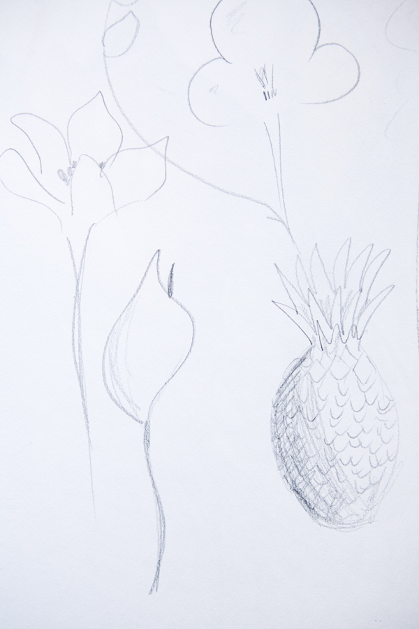
There is no such thing as "talent" when it comes to drawing. That was the big revelation at the course I did a couple of weekend's ago based around the Dr. Betty Edwards school of learning to draw. Betty (no relation) advocates that anyone can learn to draw. It's not about your hands. It's about your eyes, how you see. And, Betty claims, anyone can train their eyes to be "artist's eyes". I liked the sound of that, so was interested to find out what I would produce by the end of the weekend using Betty Edwards' classic exercises.

The basic theory goes something like this: there are two sides to your brain. A right side and a left side. The left side is responsible for logic, knowledge, facts, language. The right side deals with intuition, feelings, emotion, instinct and importantly how we view things. In most people, the left side dominates. This can be a problem when it comes to drawing, because, the left brain will always tell us how something "should" look, according to the knowledge we have amassed. However, if we allow our right brain to take over, and trust in what we see in front of us, then our visual mode can kick in and we can draw exactly what we see, not what we think we should be seeing.

Here are some of the exercises we did to get that right side of the brain (and therefore the visual mode) working:

1. Upside-down drawing

For this exercise, we replicated a line drawing, only the drawing was upside-down. What this meant it that (for the whole part), your left brain finds it more difficult to put labels (like "head, eyes, hands etc.) on the parts of the image you are copying , so it drops out, allowing your right, visual, side of the brain to focus on drawing lines. Just lines. Not hands, or legs or anything. Just lines.


I was really amazed that I managed to (fairly accurately) reproduce the lines of this portrait of Stravinsky by Picasso. I never would have been able to draw those fingers and thumbs like that if I had thought of them as fingers and thumbs rather than as just lines.

2. Blind Contour drawing

With this exercise, you don't look at the paper at all. You just draw while the whole time looking at your subject matter. Again, this engages the visual mode of the right brain.

Your drawing will look complete rubbish, since you don't know exactly where you are on the page at any one time, but that's not the point of this exercise. The point is to use it as a "warm-up", to get you familiar with the subject. So that you get to know exactly what it really looks like (not what the left brain tells you it should look like).

3. Getting perspective - using a glass frame

Conveying a sense of depth is perhaps one of the trickiest things of all about drawing. How do you render something three dimensional on a two dimensional piece of paper?

Betty Edwards devised a method of using a glass or plastic "frame", through which you see your object and, closing one eye and keeping your head in the same place (so that the view doesn't alter), drawing the outline of the object directly onto the glass frame. Like this example with the outline of my left hand:


But she didn't invent this. Even the old masters such as Duerer used similar methods to understand perspective:


Once you've got the outline, it's easier to transpose this to paper, and then, using your actual object again as reference) fill in the remainder of the details.

Here's a banana I drew using the glass frame method, and then finishing off with details and shading by just looking at the banana (ie not through the glass frame):


4. Drawing the negative space

In this exercise, instead of looking at your subject and drawing its outline, you look at the negative space - the gaps between parts of the subject and draw those "holes" instead.  To start with we did this with a fashion photograph from a magazine.


Then we combined this method with the method used in 3., above, to draw a real object in front of us, in this case, a pair of Chinese style scissors. To do this, we chose one "negative space" element to draw through the glass frame, then drew the same shape on paper and then continued working on paper, only using the frame as and when necessary to get an idea of the other shapes. Here's my final drawing of the scissors, using this technique.


5. Rendering light and shadow

Finally we considered different methods of creating light and shadow, stippling, applying different pressure to the pencil, using pencils of different softness, hatching and cross hatching. The picture below shows how you can give the impression of a three dimensional object using different degrees of cross-hatching.

I was really amazed with the drawings I produced using the methods advocated by Dr. Betty Edwards, and the techniques have certainly made me more aware of how my brain works and how this affects the process of drawing. Above all, I've learnt to trust in what I see (not what I think should be there), to give myself time (the left brain will always be impatient) and to PRACTICE, PRACTICE, PRACTICE!


Resources:
Drawing on the Right Side of the Brain, Betty Edwards
Munich Volkhochschule (Kurs "Zeichnen, aber anders")

Monday, January 9, 2012

"Chirpy Bird, Grumpy Bird" and the problem with New Year's Resolutions


This is a little sketch I did while in Strasbourg from a decorative lamp at the hotel. I just loved the little iron birds on it. It was only when I looked at it again once I got back home, that I saw how one little birdie looked really happy and chirpy while the other looks downright grumpy. It made me smile and I thought it would be an apt image to start the New Year with, as you'll see if you read on.

I'm feeling all optimistic about 2012 (like the little chirpy bird on the left). I am full of all good intentions about the things I will achieve this year. There's definitely something liberating about the beginning of a New Year. Even though it's simply a date, you feel as if you can start anew, do all the things you didn't do the year before. But there, lingering in the background, is the fear that, despite the best of intentions, any New Year's resolutions will inevitably fail. So it got me thinking, is there any point in making New Year's resolutions? Do they help us achieve anything? Or just make us feel like failures (like the grumpy bird on the right) when we don't keep to them?

Well, I think this is part of the problem: the notion of keeping or sticking to a New Year's Resolution. It means that the thing you promised to do, is something so absolute, like "exercising 3 times a week" or "drawing every day", that the minute you don't stick to it, you have failed. And if you have failed, well, why bother continuing to try again?

The other problem with New Year's Resolutions is that they are often so vague as to be completely immeasurable. You know the sort: "I'll spend less/lose weight/get healthy".  How can you tell if you've achieved these goals, when they are so vague?

So here's my take on it all:

1. Forget New Year's Resolutions.  Instead, take some time to think about what you achieved in the last year and what you'd like to be saying you achieved at the end of this year. Think of those future achievements as goals for the year (rather than a resolution you have to keep/stick to).

2. Divide those goals into "must have"s and "nice to have"s. In other words, you are putting priority on those things that are most important to you, but still allowing yourself to pursue other goals.  Here are mine:


3. For each goal, work out a plan of action as to how you will achieve it, including individual steps required, the timeframe you'll need to do them in, contacts you'll need to make etc.

4. Use the support network of friends and family that you have around you - communicate your goals (both the long-term goals and the intermediary milestones towards those goals). That way, you'll feel accountable if you can see yourself going off track.

5. And finally, be kind to yourself! Stuff happens, and life doesn't always pan out as we plan. Things get in the way of best laid plans or the overall plan changes. So don't worry if you don't quite achieve what you set out to or if you take off in a different direction. Look back on the  positive things you have done, the new experiences you've had, people you've met and things you've learnt.  You'll probably realise you've done way more than you set out to at the beginning of the year.  And as Dory from Finding Nemo says, "just keep swimming, just keep swimming...". Eventually you'll get there!


Wednesday, December 14, 2011

The Art of Letter Writing

Don't get me wrong. I love facebook. I love that I can connect and keep in touch with all the friends I have made around the world, see their "headline" news and their latest pictures. I also relish getting a long email from a friend with all their news. But I must admit that nothing quite beats opening the letterbox to find, among the various bills and notifications, a beautiful letter like this:


With a letter like this, you don't open it immediately. You wait until you have a quiet moment. You wait until you can sit with a cup of tea and no other distractions and enjoy what will unfold in the letter.  You'll read it a couple of times and then put it in a safe place.  Equally, the same consideration will be given to your response. You'll go and find your nice writing paper and choose the right time to compose your response.

We've become so used to fast communication that the whole, somewhat indulgent, process of receiving and writing a letter got me thinking.  What makes a letter so special? Do we write differently in a letter compared to an email or a facebook message? I think so.

In a letter, we may convey some of the happenings of recent days, but we may also be more likely to provide some details about where we are writing, how we are feeling, what sounds we hear and what we might see out of the window. We can, through words, paint a picture of a little snippet of that moment in time. A moment when we have cast out other distractions and focused purely on communicating to a particular friend. This is, I think, both the "art" of letter-writing and also the thing that makes it so special. It's a real sign of respect that your friend has taken the time to sit down, write about their life to you, seal and address the letter and take it to the post office. It's not as easy as an email. And for that reason, it's more special.

Let's not lose the art of letter-writing. I'm sure we all know someone who would appreciate a letter in the post. Now is as good a time as any to get out your writing paper and pop in a little letter with a Christmas card. And you never know what will appear in your letterbox in a couple of weeks...

Wednesday, November 30, 2011

Day 30 "Art Every Day Month" - We did it!

Wow, what an amazing month it's been! This is the first year I've participated in Art Every Day Month and it really has been a great challenge to create some kind of art each day. I feel it's really moved me forward, I am really starting to learn to draw now (hooray) as well as trying out some other skills and I feel energised to continue the journey. I'm now looking forward to being able to spend a bit more than a day on some projects and really getting to grips with my illustration course.

Well done all the other AEDMers - here's a little papercut for you all!


p.s. if you want to keep following my work and creative musings, then please "like" the Drawn To Creativity facebook page: http://www.facebook.com/pages/Drawn-to-Creativity/101175296656224

Thursday, October 6, 2011

Course addict

The other day, the DHL man arrived with a big package. Normally, as I am the only person in my apartment building during the day, I am the caretaker for packages for everyone else. So I was pleasantly surprised to discover this was actually for me.  I opened it to find a big file of the course materials from the Open College of the Arts. Wahoo! How exciting! These were the materials for the illustration course I will be doing over the next year. OK, so maybe some people wouldn't find a stack of course materials that exciting. But here's the thing. My name is Lia and... I am addicted to courses.


Actually, I like to think of it more as been addicted to learning.  For me, there is nothing worse than feeling I am at a standstill, not learning or moving forward with something. I just can’t get enough of learning new things.  When I first got into photography, I did a few courses. And with each one, I always felt I moved on another giant stride. Then, having had a little taste of fashion photography, I took an evening course in fashion illustration, which then led me to a weekend dress-making course, a week long textile design course at Central St Martins and now illustration. Hopefully this will all come together in some grand new career plan, but for the moment, I am just going to enjoy the learning process and see where it takes me.

Obviously one of the great things about taking on a course to learn a new creative skill is the techniques and tips you pick up from your tutor. But the other wonderful thing is the other people you meet on that course, who can inspire you and, in many cases, may become life-long friends with whom you share that particular interest.

So I encourage you to check out what you local community or arts college is offering, see what might be fun and sign up. It doesn’t have to have any career-orientated goal. It’s ok just to pick up a new hobby and make some new friends. It might be a one-time only thing that you do just for fun (like the time I took a tango class) or it might even be something that introduces you to a whole new world and inspires a change of career. Who knows...

Tuesday, September 27, 2011

From idea to creation


One of the problems of those who are creatively-oriented is getting from idea to actual creative output. We are full of ideas. Sometimes too many ideas. But actual doing something with those ideas or finding the time to work on and complete a project is another thing all together. 

Here are my top 5 tips for getting from idea to realisation (i.e. creation) of the idea.

1.  Start broad: When working on a project, don’t necessarily go with the first thing that comes into mind. Play with lots of ideas. Talk to friends/colleagues about them.  Sometimes by just talking though an idea aloud you will know that it’s not going to work or that it may have potential.  Don’t take it all too seriously or put pressure on yourself that the idea must be “the one”. The ideas may not all be good but by working through a few, you will eventually get to the right one. As Edward de Bono says “It is better to have enough ideas for some of them to be wrong, than to always be right by having no ideas at all”.
2.  Then focus: From all the ideas you have worked through, you should eventually arrive at something that you know feels right. The more focused an idea, the better the final output will be. My own experience of this has been with planning work to feature in photography exhibitions. With the exhibition I mentioned in Collaboration across the globe, the initial idea was the 1950s. But this was really broad. So I decided to focus on haute couture and the Dior "New Look" era. That then dictated the research I did, the inspiration board I created to communicate the idea to the other people involved, the image taking and final editing and post production work.
3.  Set goals: This is nothing new, but so often we can drift along with an idea, never really getting anywhere. Set yourself a deadline. Work out the steps that need to achieved along the way (for example, preparing a brief, research, initial sketches/drafts, finding the people you will need to involve) and the timeframe in which you will do them. Keep them bite-sized. Write it down. Put it in your calendar. If other people are involved, make sure they are aware of the timescale and what needs to be achieved by when and who is responsible.
4.  Be part of a creative community: For me, I find the fortnightly meetings with the Munich Creative Arts Group a fantastic way to make sure I am setting myself goals and then achieving them (I don’t want to turn up and tell 10 people I haven’t done what I said I was going to do). If you don’t have a group like this in your area, then start one up. You might be surprised at the number of people you know who want to do something creative in their lives and the energy that bringing those people together can create.
5. Have fun! Creativity should be fun. It shouldn’t be a chore. If you have set yourself a goal, for example of writing a story or learning a particular piece of music, but you really just don’t want to do it, then it’s probably not what you are passionate about. Channel your energies into something you find fun and enjoyable and make sure it is something that you choose to do, not something you have told yourself you have to do. That’s when the childlike, playful quality emerges and the best creations are made.

Right, now I'm going to practice what I preach and start
planning my ideas for the "Urban" photography exhibition I'm
participating in later this year. I've already narrowed it down
to a series of portraits reflecting "the Urban community" so
now I need to set myself some goals to achieve...

Thursday, September 15, 2011

When did you stop having hobbies?


When you were at school, did you have a whole bunch of hobbies that you did, not for any long-term career goal, but simply because they were fun and you enjoyed them? As a child and teenager, I probably did have an annoying amount of hobbies (including Irish dancing, kung-fu and ballet), but my main hobby was always music - playing piano and being a cellist in the local youth orchestra. So how I went over 10 years hardly playing a note, I don’t know. For some reason, when we "grow up", we leave hobbies behind. Hobbies are associated with something kids occupy their time with and it’s not exactly socially acceptable to have a "hobby" beyond the age of 17.

A few years ago, I realised over the course of my time training to become and practising as a lawyer, I had lost all my old hobbies. I envied the resumes of the young graduates entering the profession and all their interests outside of the law. So that was it. I bought a piano. It was one of the best things I ever did. I am not the greatest pianist in the world, nor will I ever be, but it all came back to me much quicker than I thought.  It may not serve any career-orientated purpose (since, let’s face it, with my tiny hands, I’m never going to be a concert pianist), but when I’m on my own, playing a piece, I get lost in it. I am allowed to have emotions and for those emotions to be channelled through the music. I can imagine a story behind the music and can feel and live that story while I play. Yes I make mistakes, but it doesn’t matter. For that time, while I’m playing, everything else goes away. And that in itself is enough of a reason to play.

So here’s my challenge to you. Stop telling people you "used to" do this or that. Pick up the instrument you used to play, draw and paint again or take up a dance class. Why should kids have all the fun? You might surprise yourself.


Thursday, September 8, 2011

Stepping the other side of the lens


As a photographer, I get to hide behind the non-scary side of the lens, giving a constant feed of directions and instructions to my subject on how to pose. Today the tables were turned on me. Talented Munich-based painter, Julie Galante* is working on a series of large-scale paintings of women in dirndls** and I offered to sit for one. Julie paints mostly from photographs, so we spent some 20 minutes or so with me posing in my new dirndl while Julie took pictures.
I’ve taken self portraits before as I’m a big believer that they are a really useful exercise in understanding how it feels to be the other side of the lens, but I must admit it had been a while.
I felt a bit self-conscious to start with, but we soon got into the swing of things, moving through subtle variations of different poses and expressions, using hands (I love hands in portraits) and before we knew it, Julie had taken over 500 shots and I certainly had a better appreciation of what it’s like being in front of the camera. Hopefully Julie will find something of inspiration and I’ll be able to report back with the end result in a few weeks!

*You can see Julie’s work at http://www.floggingthemuse.com/
**A dirndl is the traditional Bavarian dress for women. For more info, see this great article: http://rachelsstyleguide.blogspot.com/2011/09/in-praise-of-dirndl-oktoberfest-2011.html

P.S. Isn't Julie's studio space fab? That light! Oh, so envious!

Wednesday, September 7, 2011

Taking the time to stop and stare


One of the problems I have found with travel photography is that, if I’m not careful, I can spend more time looking through the viewfinder than actually being truly present in a place.

So I have now taken to doing something I used to do years ago. I bring a sketchbook with me, and try to take some time out to draw something of interest on my travels. On a recent day trip to the Bavarian town of Augsburg, I did this little illustration of the “Rathaus” (town hall).  I use pen because, unlike pencil, it means you just have to live with your mistakes and get on with the drawing, so it’s much quicker. I also think the inevitable imperfections from having to make permanent marks add character.  It took about an hour and certainly made me appreciate the intricacies of German 17th century architecture!


Alternatively, if you don’t have the time for a sketch, sometimes just turning around with your camera can provide you with a new perspective on a scene…


Tuesday, September 6, 2011

The power of the present moment. And some pretty flowers.

It took me a long time to cotton on to this, but in order to create anything, whether it’s a photographic image, painting or poem, you need to be present in the moment, aware of the world around you. So often our thoughts are consumed by the future (“What shall I cook for dinner this evening?”) or the past (“I wish I has said…”), we forget that the only reality is right here, right now. As I was doing some macro (close-up) photography of the flowers around the apartment today, it occurred to me why flowers and all things botanical are one of the most common themes in art, photography, textile design and poetry. I think it’s because, for a moment, we are so transfixed by their perfect structure, regularity and colour combinations that, just for that moment, we forget about the other worries of the day and are truly in the present. Here are some of the shots I took.


Technical info: Shot with Canon 5D, 100mm 2.8 macro "L" lens at f3.2-f.3.5 (with varying shutter speeds and ISO), about one stop overexposed. Manual focus. Processed in Camera Raw. No changes made in Photoshop.


All images copyright Lia Edwards 2011. Not to be reproduced or used for any purpose without prior written consent.