Showing posts with label Ilustration; OCA;. Show all posts

Monday, March 5, 2012

Words to Pictures: Exercises 5 & 6 OCA Illustration Course


In this post, I've combined Exercises 5 and 6 of the course. Exercise 5 is about turning words into pictures and involved taking one of the specified words (I chose "Exotic" from the list) and sketching as much as possible around this theme. Exercise 6, then involved taking the same word and creating an inspiration board around that word from pictures in magazines, fabrics, textures. I thought it would make sense to effectively do both of these exercises together.

First, I did a spider diagram around the word "Exotic" (fig. 1).

Fig. 1


The spider diagram threw up a lot of possibilities, but I decided to focus on exotic flowers and plants. I had a go at sketching things around this theme with no reference, just from my imagination and memory (fig. 2 and fig. 3).  The aim here wasn't to produce some beautiful drawings, but rather to translate into picture form some of the words from the spider diagram.  I'm not a big fan of pastels, but there were quick to work with and meant I could colour large areas quickly, even if the result wasn't really my style. 

Fig. 2

Fig. 3

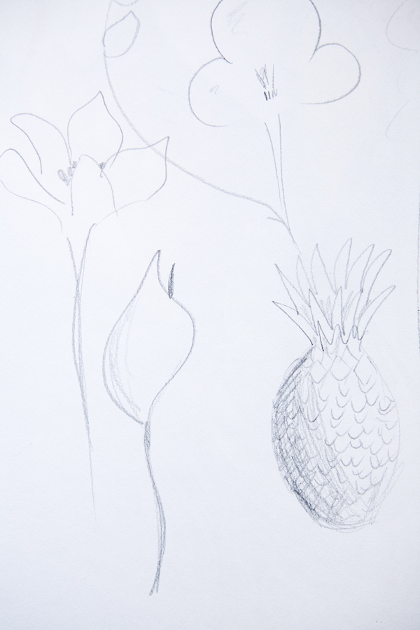
To get a look at the real thing, I decided to make a visit to the Munich Botanical Gardens, where I made some sketches (fig. 4 and 5) and photographs (fig. 6 and 7):

Fig. 4


Fig. 5

Fig. 6

Fig. 7

Finally I went through fashion and interiors magazines, the Bridgeman on-line library and some of my own reference books, and used those materials as well as some of my own photographs from the botanical gardens to put together this colourful inspiration board (fig. 8). 

Fig. 8

What I learnt:

I was really interested to see with these exercises how I would get from words to pictures. As an ex-lawyer, I tend to find words easier than pictures. I found it particularly difficult to try and sketch ideas from memory, but was surprised once I got thinking, how I could visualise some exotic flowers and leaves from memory, even if I wasn't that impressed with my sketches of them. It was also good to go to the botanical gardens to draw the real thing and get some more drawing practice (although this did take way longer than the initial "memory" sketches. Drawing from memory is something I need to practice more, but that's something that should improve as my general drawing skills progress.

My favourite part of this exercise was pulling together all these different reference materials into my inspiration board. I can definitely see how having this up in front of me as I work, would inspire me to get painting and drawing around the theme "exotic". Who knows, this may even inspire a fabric design along this theme...

Wednesday, February 29, 2012

Spider Diagrams: Exercise 4, OCA Illustration Course

This exercise involved making spider diagrams for a number of given words. The idea is to get you generating lots of ideas around one key word: to consider connections with a word or an idea, your own interpretation of what that idea means, colours, textures, places, feelings. Then to ask another person what words they come up with and see how many joint words you agree on and whether they come up with new ideas.  The idea behind this kind of brain-storming is that the more ideas you have for a particular commission, the more likely you are, through testing those ideas, to come up with the idea that best meets the needs of the commission.

Here are my spider diagrams for the words "Seaside" (fig. 1), "Childhood" (fig. 2), "Angry" (fig. 3) and "Festival" (fig. 4).  The words that came to my mind are in black, then I asked my husband to brain-storm the same words - his words are in red. Where we came up with the same words, I've underlined them in red.

Fig. 1

Fig. 2

Fig. 3

Fig. 4

What I learnt:

Some words I found easier than others to brainstorm, but once I got started and just wrote down whatever popped into my head, the words really started to flow. One word would lead to another and another, then something on a completely different tangent would pop into my head and that would then lead to other words.

The words would usually come first from my own experience of things associated with that word, especially with the "Childhood" brainstorm - we've all had a childhood and that's the only childhood we know of, so that's naturally the one we'll think about.

When I had exhausted words related to my own experience I would think about other interpretations. This was particularly the case with the word "Festival" which can have so many meanings. At first I thought about music festivals like Glastonbury, then I thought about traditional festivals, for example in Indian culture. Then it occurred to me that Christianity also has it's own "festivals".

I was surprised by the number of words I came up with and how quickly the page filled up with words.  The word I found hardest to brain-storm was "angry", perhaps because it is an emotion, rather than a visual place or memory or event, like the other words. I'm sure that would make "angry" much more difficult to draw too.

It was really interesting to see what words my husband came up with - on the whole, completely different to the words that popped into my head. It goes to show it's worth asking other people's opinions when generating ideas since we all have different experiences which can result in different ideas.

Writing a Brief: Exercise 3, OCA Illustration Course

This exercise involved writing a brief for an illustration. Illustrators usually work to a brief from the client so the idea behind this exercise is to provide a better understanding of what a brief may include and how this results in the final artwork.

For this exercise, I have chosen an illustration used on a full page advert in Vogue for Vivienne Westwood's perfume "Cheeky Alice" (fig. 1).

Fig. 1

In order to prepare my brief, I researched the Vivienne Westwood brand, as well as the concept behind this perfume and made notes around the brand identity and the characteristics of the perfume. I then considered the role of the illustration, who the audience would be and what "flavour" the illustration should have, as well as other details that the Vivienne Westwood creative team may have specified in preparing the brief for this illustration (fig 2).

Fig. 2

Here is the brief I prepared:

Vivienne Westwood will be launching a new perfume for spring, called "Cheeky Alice". As the name suggests, the perfume is feminine (with fresh and floral notes) but also sensual and a little bit provocative. This is a perfume that might be worn by a women aged 18-30, confident with her femininity, who wants to show that she is sexy, cheeky and a bit naughty. The Vivienne Westwood customer is one that is daring, pushes boundaries and is not afraid to be different from the rest of the crowd. The perfume will be promoted in fashion magazines, websites, beauty counters of the major department stores as well as traditional advertising billboards. For our advertising campaign, we need an illustration of a 50s style pin-up girl, vintage looking, but with something that indicates this is a modern-day girl (for example, she could be wearing Vivienne Westwood shoes). The pin-up girl will, of course, be sexy, but with an air of innocence - fresh and fun, like the perfume itself. A photographic image of the perfume bottle, with it's signature double red hearts and look of a bottle of magic potion will need to appear prominently in the image and there will need to be room for the Vivienne Westwood logo. The only text on the image will be the word "presents" under the Vivienne Westwood logo and a subtitle "a new fragrance for women". The brand colours for this perfume are a peachy red and gold and therefore the illustration must incorporate these colours. Above all, the image needs to capture the attention of the viewer, to draw them in and inform them immediately of the character of the perfume.

What I learnt:

This exercise was actually harder than I thought. Putting myself in the shoes of a creative director or art buyer of a fashion organisation really made me think about the multitude of things that need to be factored into to an illustration for an advertising campaign - the corporate identity, the branding of the goods to be advertised, colours, feel, layout, what text would need to be incorporated, who the audience would be. It also got me wondering about how much direction the illustrator would get for this type of commission. I imagine the illustrator's artistic freedom would be quite restricted and that the advertising team for Vivienne Westwood would have had a clear idea about exactly the image they wanted to see. I could imagine briefs for other commissions would be a lot less detailed and provide more scope for the illustrator to express his or her own creative style.

Tuesday, January 24, 2012

Illustration pour Vogue (Exercise 2, Illustration Course)

The second exercise of the OCA Illustration course involved choosing an editorial (magazine or newspaper article), reading it through a couple of times, picking out some key words, working out what the key message of the editorial is and then creating an illustration to communicate that message.

I thumbed through one of my old Vogues, and came across an article called "Liquid History" by Sophie Dahl. I love her writing (her cookbooks are brilliant), so although the subject matter (perfumes) was not really my thing, I was drawn to read it, and decided to use it for this exercise.

I can't replicate the entire article here, but in short, it went through Sophie's personal history of perfumes, how they relate to your identity, how you choose different perfumes at different times of your life either to reflect who you are, or who you'd like to be.  I took two key words away from the article: "Scent" and "Identity". In one section, she talks about "a glamourous friend whose French-Iranian mother wore stockings and suspenders, fur coats and the patchouli-laced L'Heure Bleue". The perfume was as much a part of this woman's outward identity as her glamourous fur coat. I loved this description so much, that it ended up being the inspiration for my final piece for this exercise (fig. 1).

Fig. 1


The Process

For my tutor and those interested to read more, here was the process I went through to get to this.

1. After reading through the article a couple of times, I did a spider diagram of key words (fig. 2):

Fig. 2

 2. I decided that the article really boiled down to two things: "Scent" and "Identity", and so I set about drawing a few thumbnail sketches with some different ideas (fig. 3):


Fig. 3

3. I decided to go with my third thumbnail, inspired by the French Iranian patchouli doused mother - woman as a perfume bottle (John Paul Gaultier-esque), with a fur coat draped around her shoulders, a 1950s Dior style hat dipped to disguise the face and other bottles in the background (the implication being that those other perfumes don't have the same personality).

4. I wanted the image to be very simple, quite graphic, a limited colour palette of black, red and grey (reminiscent of the Dior New Look era). Bearing in mind the audience (Vogue readers), I wanted it to have a fashion illustration feel about it, but more 1950s than anything too modern. I flipped through some books I have on fashion illustration for inspiration (fig. 4a) and then sketched out a rough composition. I then experimented with gouache paint using different brushes and brush strokes until I was getting the kind of strokes and textures I wanted for my final piece (fig. 4b).

Fig. 4a
Fig. 4b

5. Initially I painted over my sketched out composition, but this lacked the fluidity and spontaneity I wanted, so I started afresh on a blank sheet. I think this provides much more looseness to the brush strokes, because I wasn't trying to follow any sketched out lines. Finally I scanned it in and applied a warm filter over the image in Photoshop to give it more of a 1950s feel (fig. 5).

Fig. 5

What I learnt:

I really enjoyed the process of doing this exercise. It shows that illustration goes beyond just producing an image which is pleasing to the eye. It is about communicating an idea visually. In the case of illustrating the editorial I chose, it was about drawing the audience in, giving them an idea of what the article might be about, so they want to read more. I enjoyed the process of working out what idea should be communicated and thinking of different ways to show this. I also enjoyed using gouache paint. I like that the colours can be really strong in some places and more like watercolours in others. I'm sure I could have spent even longer refining this idea further, perhaps exploring some of the other ideas more fully. I also think perhaps a portrait format would have worked better for a magazine.

Sunday, January 15, 2012

Inspired by the Old and the New: History of Illustration (Exercise 1)

This exercise (the first in my Illustration course with the Open College of the Arts), involved researching a historical illustrator and a contemporary illustrator, comparing their styles and the media they worked in and then producing two illustrations, based on the same subject matter, in the style of each illustrator.

Here are my finished pieces for this exercise, on the theme of "The British Countryside", based on the style of Edward Bawden (fig 1.) and C.S. Neal (fig. 2):

fig. 1


fig. 2


And now for the longer part (for my OCA tutor and anyone else interested in the process behind these images).

Part 1: Historical Illustrator - Edward Bawden

For this exercise, I chose to research Edward Bawden (1903-1989) as my historical illustrator.  Bawden was fascinated with the printing process and much of his work was done via linocutting, lithography and copper engraving.  It is evident in the images from his prolific career (particularly his work for London Underground, see fig 3), that Bawden was very much an "observer" of life and had a great ability to find humour in day-to-day life.

fig 3.

Did his work seem "old-fashioned" to me? Well, in some ways, it looked almost contemporary, perhaps because of the clean graphic lines which the various printing processes he used (linocutting, lithography and copper engraving) lend themselves too. Perhaps also because there is a current post-modernist trend for all things "vintage". But then when you look closer at the images, the subject matter tells you they are off a time gone by (barber's shops, people wearing hats, more buses than cars on the streets of London). Also the detail in the technique immediately shows that this is not work that has been created digitally.

This high level of technique using printing media would be the first hurdle in creating a piece of work in Bawden's style. However, I started off by copying some of his simpler compositions (fig 4a, my drawing, and 4b, Bawden's original.)

fig. 4a

fig. 4b

Inspired by sketches and photographs I had taken on a walk along a canal in Buckinghamshire with my mother last November (fig 5 and 6), I decided the subject matter for my artwork for this exercise would be "The British Countryside".

fig. 5

fig. 6

This theme felt in keeping with the work Bawden did for London Underground, illustrating places that people could travel too by tube.  I chose linocutting as my medium, something pretty new to me, but a medium Bawden used frequently.

Overall I was reasonably happy with the result (fig. 7). The decorative border (of bird footprints), the composition, textures and everyday people are all inspired by Bawden's work. With hindsight, it could have had some of the underlying humour of Bawden's work (perhaps one of the swans going after the dog, although I wasn't sure if that would convey the right message about visiting the countryside). It is far from a perfect example of linocutting (I am still very new to the technique), but I like that you can tell this was made by hand.


fig. 7

Part 2: Contemporary Illustrator - C.S. Neal

I became aware of the work of Christopher Silas Neal (see redsilas.com) through the children's book "Under and Over the Snow" (fig. 8). It is illustrated beautifully and perfectly for the subject matter. I then discovered he has done much work for the New York Times, as well as other publications and book covers.


fig. 8

On his website, C.S. Neal tells you about his processes. He works using a combination of drawing, painting, braying, hand lettering and other manual techniques and then he composes and colours the elements digitally. This combination of digital and manual techniques elevates his work beyond the often too perfect, machine-made look of digital illustration and imbues it with the definite touch of a human hand. His style often plays with perspective: large subject matter in the foreground, with your eye then being drawn to something much smaller way off on the distance.

As I am only just starting to learn the Adobe Illustrator software, I didn't feel I yet had the skills to produce artwork in C.S. Neal's style digitally. However, it struck me that essentially he works in collage. So, I opted to use manual collage techniques with coloured paper, pencils, pastels and a variety of hand printing techniques (that I learnt on a recent printing course) to create my "contemporary" C.S. Neal inspired version of "The British Countryside" theme (fig. 9 and fig. 10).

fig. 9

fig. 10

From what seemed like an impossible task in the beginning, I'm pretty happy with the final artwork. I like the textures from the hand-printed elements of the collage, particulary the trees at the top (made by inking up some folded brown paper) and the house and I like the shape of the swan and the textured "plaque". I'm not sure about the reflection, whether that takes up too much room at the bottom of the composition, so perhaps that would go if I did this again. I think the image could look a bit more like the British Countryside too - it's a little too open and not green enough, but that probably comes from taking the "Over and Under the Snow" book as inspiration - it's set in North America.

What I have learnt from this exercise:

It has been really informative to look at other people's work, both historical and contemporary and to have a go with some of the media that these illustrators have used. Next time, I will try to consider more options and do more "thumbnail" sketches before deciding on a final idea. I need to think a bit more freely, consider more options and just play around with techniques a bit more. I have a tendency to be fairly single-minded in my thought process (probably from my days as a lawyer), planning and executing everything carefully, so now I am conscious of this, I will try to loosen up a bit!

Nevertheless, I have learnt both technical skills (linocutting, printing, drawing, painting textures, hand-lettering, collage) as well as compositional skills. I hope to improve on these throughout the duration of the course, but I am happy with the start I have made through this exercise. I will definitely continue to expand my knowledge of historical and contemporary illustrators and work on both manual printing and collage techniques and getting to grips with digital illustration.

Key Resources:
Edwards Bawden's London, Peyton Skipwith & Brian Webb
Design: Edward Bawden, Eric Ravilious, Peyton Skipwith & Brian Webb
www.redsilas.com