Weeks 2 and 3 of Module 2 of the
Surface Pattern Design eCourse were all about understanding trends in the design world. How is it that suddenly owls are all the rage, or digital florals, or a particular colour? There's a huge industry involved in trend forecasting for fashion and homewares, so as designers for those markets it's vital to be aware of current trends and trend predictions in our design work.
This isn't to say that you always have to follow those trends. It's certainly OK to "do your own thing", but as a surface pattern designer you should at least be aware of the images that surround your customers and events that may influence your customers buying habits (for example the Olympics, or Christmas).
Here are some of the creative exercises we were set in Week 2 to help our understanding of trends in design:
Seeking out trends
The first exercise was to get out and start making notes about the trends you see in the stores and on what people are wearing. I took my camera with me and headed in to town to see what the department stores, big labels and smaller boutiques had in store for us for Autumn/Winter 12/13. These are some of the trends I noticed:
1.
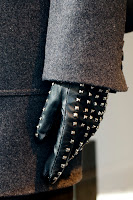
Black is Back! Oh no - surely not, I thought, as I saw window display after window display with mannequins clad only in black. At least the black trend is tempered somewhat by a smattering of metallics (think studs and faux diamonds), interesting textures, cut-outs and lace patterns.
2.
Jewel tones - not all colour has been forgotten though. I'm pleased to report we'll be seeing lots of the jewel-like tones such as a deep emerald, rich amethyst purple, bright pink, and garnet red (hooray, some of my favourite colours!)
3.
Tangerine Tango lives on - This year's hot colour (see below) is still everywhere and looks set to continue to be a theme this A/W, albeit it a more muted tone, apt for Autumn.
3.
Textured Knits - we can also look forward to snuggling up in knits in various patterns and textures:
Other trends included strong graphic prints, digital prints, photographic images being used on textiles and hand-printed designs. In terms of motifs, anything woodland is still a big theme for this Autumn/Winter - think owls, foxes and birds of all descriptions.
In summary, there's lots to choose from and creativity and individuality are strong themes. I'm really looking forward to Autumn!
Tangerine Tango - Giftwrap Brief
Every year, Pantone (the leading company for colour matching, ensuring a standardised colour system throughout the designing and manufacturing process), selects a Colour of the Year. For 2012, the colour was "Tangerine Tango":
Pantone described the colour as "
reminiscent of the radiant shadings of a sunset... marrying the vivaciousness and adrenaline rush of red with the friendliness and warmth of yellow.... providing the energy boost we need to recharge and move forward".
Immediately upon the announcement of Tangerine Tango as the Colour of the Year 2012, designers began using the colour (knowing that other designers would also be) in readiness for the demand that would inevitably follow once consumers started to see this colour everywhere.
In some ways, this type of trend prediction is effectively a self-fulfilling prophecy. However, the prediction needs to be carefully considered in the first case to consider the likely mood of consumers in a particular season and the desire for something fresh and different to what has come immediately before as well as reflect what is happening in the design world at the time.
So, bearing in mind the current trend for all things tangerine, the brief for this creative exercise was to create a fresh pattern for use on giftwrap, using Tangerine Tango as the primary inspiration. Here's what I created from some sketches of pansies, using Tangerine Tango as the background colour with the pansy motif in a fresh palette of pale grey and aqua:
Giftwrap is a great example of a "placement" design. As the wrap will be a set dimension, it's not necessary for the design to be in an actual technical repeat (for example as is the case with fabric or wallpaper). I've just laid it out to give the impression of a repeat.
I printed out my design and used it to wrap a small box to see how it would look:
I was pretty chuffed with this! I could also see this design on beauty product packaging or stationery such as diaries, notebooks or journals.
Country/Cultural Trends
We were then encouraged us to think about trends in the country we live in - whether they are tied to international influences or the country's own culture/religion/landscape.
I live in Munich, which is in the state of Bavaria in Germany, a state with very much it's own identity, history and cultural traditions. Here are some examples of "Bavarian" style (as you can see hearts are a big theme!):
This has really made me think about how I might be able to work my own style into something Bavarian themed for a design collection. Definitely something to consider for the future.
Celebration and Holiday Trends in Stationery
There are certain trend-influencing events that we know will happen every year at a particular time of year (for example Christmas, Valentines Day, Mother's Day etc.). Others will happen throughout the year (birthdays, weddings, christenings, anniversaries etc.). These are obviously mainly of relevance in the stationery industry. As a designer (particular if you're designing for stationery products and greetings cards), it's important to have a range of designs in your portfolio that can work for all these different events.
Rachael (our wonderful course tutor) encouraged us to think about these different events and which our designs might be most suited to, as well as collecting samples of designs that particularly appeal to us.
Major Events: Olympic Inspired Design Brief
Major events are a great opportunity to create designs which will be sought out by consumers to commemorate and celebrate those events. A brilliant example of this is the twin London major events of the Diamond Jubilee and the 2012 London Olympics. Unless you've been living in a cave, you'll have seen all the Union Jack and London icon inspired designs flooding the shops, on everything from teatowels and mugs to fashion accessories, food and beauty packaging:
 |
| Designs by Emma Bridgewater for the Diamond Jubilee |
 |
| Sephora - Olympic inspired nail polish |
With this current "major event" trend in mind, the final exercise for this week was to design a pattern inspired by the London 2012 Olympics. Since the official London 2012 logos and the Olympic rings are protected intellectual property and there are legal restrictions on anything which would depict an association with the London Games (set out here
http://www.london2012.com/documents/brand-guidelines/guidelines-for-non-commercial-use.pdf), I ended up going for a generic London/Great Britain design on this teatowel design, using images I had shot in London on film years ago together with some paint drip motifs I had from previous mark-making exercises (which I scanned in and digitally recoloured). I was aiming for an edgy "Cool Britannia" look.
They are a bit different from my usual intricate pretty style, but it was fun to experiment and they have the playful, edgy look I was aiming for. I may even go ahead and get them printed as tea towels as a memento of our fantastic London Games!


.JPG)


.JPG)
.JPG)


.JPG)
.JPG)